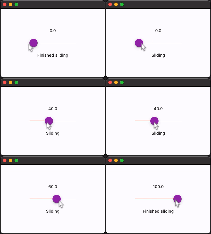
CupertinoSlider
An iOS-type slider.
It provides a visual indication of adjustable content, as well as the current setting in the total range of content.
Use a slider when you want people to set defined values (such as volume or brightness), or when people would benefit from instant feedback on the effect of setting changes.
Inherits: LayoutControl
Properties
-
active_color(ColorValue | None) –The color to use for the portion of the slider track that is active.
-
divisions(int | None) –The number of discrete divisions.
-
max(Number) –The maximum value the user can select.
-
min(Number) –The minimum value the user can select.
-
thumb_color(ColorValue | None) –The color of this slider's thumb.
-
value(Number | None) –The currently selected value for this slider.
Events
-
on_blur(ControlEventHandler[CupertinoSlider] | None) –Called when this slider has lost focus.
-
on_change(ControlEventHandler[CupertinoSlider] | None) –Called when the state of this slider changed.
-
on_change_end(ControlEventHandler[CupertinoSlider] | None) –Called when the user is done selecting a new value for this slider.
-
on_change_start(ControlEventHandler[CupertinoSlider] | None) –Called when the user starts selecting a new value for this slider.
-
on_focus(ControlEventHandler[CupertinoSlider] | None) –Called when this slider has received focus.
Examples#
Handling events#
import flet as ft


def main(page: ft.Page):
    page.horizontal_alignment = ft.CrossAxisAlignment.CENTER
    page.vertical_alignment = ft.MainAxisAlignment.CENTER
    page.theme_mode = ft.ThemeMode.LIGHT

    def handle_change_start(e: ft.Event[ft.CupertinoSlider]):
        slider_status.value = "Sliding"
        page.update()

    def handle_change(e: ft.Event[ft.CupertinoSlider]):
        slider_value.value = str(e.control.value)
        page.update()

    def handle_change_end(e: ft.Event[ft.CupertinoSlider]):
        slider_status.value = "Finished sliding"
        page.update()

    page.add(
        slider_value := ft.Text("0.0"),
        ft.CupertinoSlider(
            divisions=20,
            min=0,
            max=100,
            active_color=ft.Colors.PURPLE,
            thumb_color=ft.Colors.PURPLE,
            on_change_start=handle_change_start,
            on_change_end=handle_change_end,
            on_change=handle_change,
        ),
        slider_status := ft.Text(),
    )


ft.run(main)
Properties#
active_color: ColorValue | None = None
The color to use for the portion of the slider track that is active.
The "active" side of the slider is the side between the thumb and the minimum value.
divisions: int | None = None
The number of discrete divisions.
If None, the slider is continuous.
value: Number | None = None
The currently selected value for this slider.
The slider's thumb is drawn at a position that corresponds to this value.
Raises:
Events#
on_blur: ControlEventHandler[CupertinoSlider] | None = None
Called when this slider has lost focus.
on_change: ControlEventHandler[CupertinoSlider] | None = (
    None
)
Called when the state of this slider changed.
on_change_end: (
    ControlEventHandler[CupertinoSlider] | None
) = None
Called when the user is done selecting a new value for this slider.
on_change_start: (
    ControlEventHandler[CupertinoSlider] | None
) = None
Called when the user starts selecting a new value for this slider.
on_focus: ControlEventHandler[CupertinoSlider] | None = None
Called when this slider has received focus.
