Dropdown#
Inherits: LayoutControl
Properties
-
autofocus(bool) –Whether the control will be selected as the initial focus. If there is more than
-
bgcolor(ControlStateValue[ColorValue] | None) –The background color of the dropdown menu
-
border(InputBorder | None) –Border around input.
-
border_color(ColorValue | None) –Border color. Could be
transparentto -
border_radius(BorderRadiusValue | None) –The border radius applied to the corners of the dropdown input field.
-
border_width(Number) –The width of the border in virtual pixels. Set to
0to completely remove border. -
capitalization(TextCapitalization | None) –Configures how the text input should be capitalized.
-
color(ColorValue | None) –Text color.
-
content_padding(PaddingValue | None) –The padding for the input decoration's container.
-
dense(bool) –Whether the TextField is part of a dense form (i.e., uses less vertical space).
-
editable(bool) –Whether the dropdown allows editing of the text input field.
-
elevation(ControlStateValue[Number | None] | None) –The dropdown's menu elevation in various
ControlState -
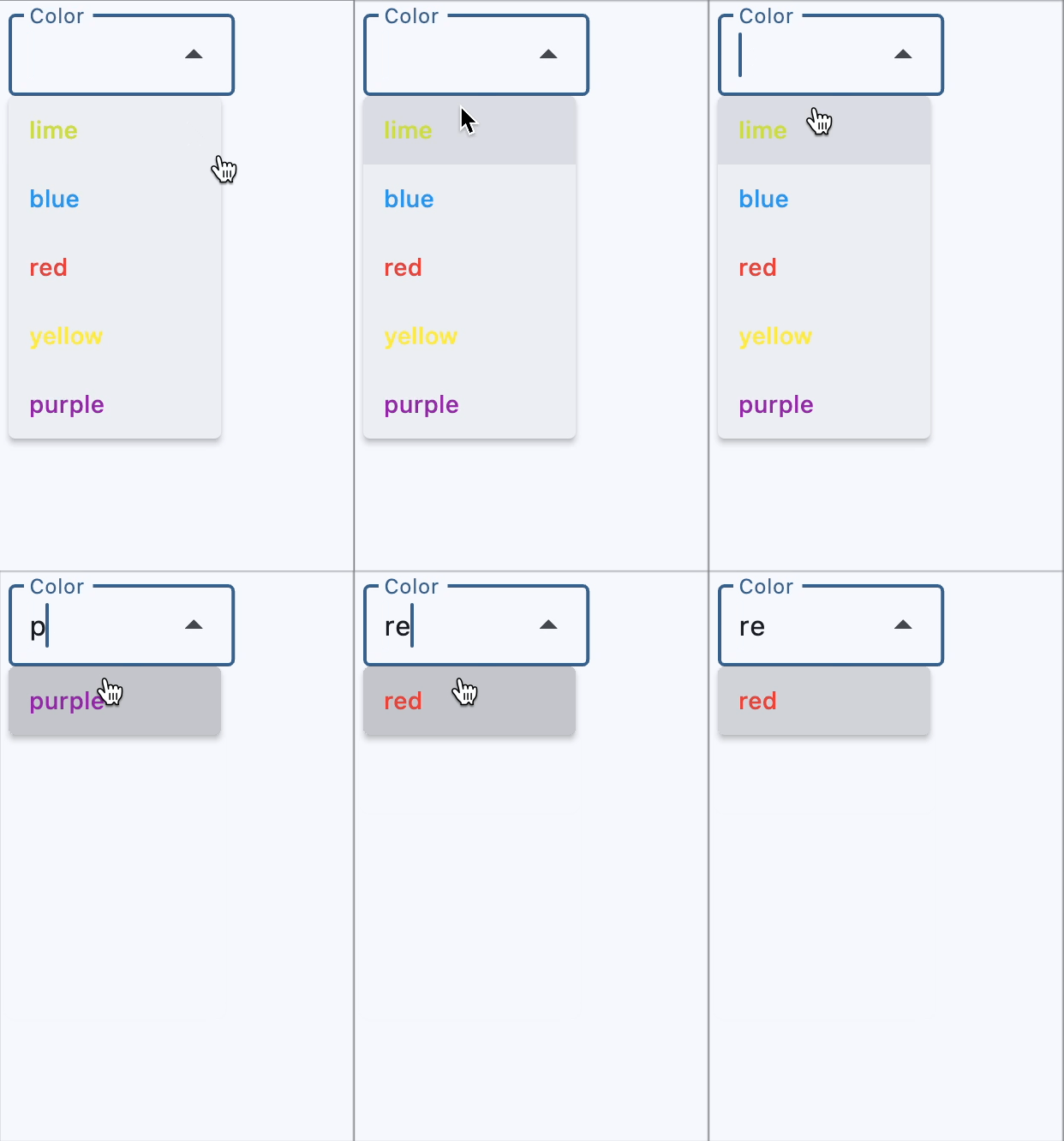
enable_filter(bool) –Determine if the menu list can be filtered by the text input. Defaults to false.
-
enable_search(bool) –Determine if the first item that matches the text input can be highlighted.
-
error_style(TextStyle | None) –The
TextStyleto use for -
error_text(str | None) –Text that appears below the input border.
-
expanded_insets(PaddingValue | None) –The insets for the expanded dropdown menu.
-
fill_color(ColorValue | None) –Background color of the dropdown input
-
filled(bool) –Whether the decoration's container is filled with theme
-
focused_border_color(ColorValue | None) –Border color in focused state.
-
focused_border_width(Number | None) –Border width in focused state.
-
helper_style(TextStyle | None) –The
TextStyleto use for -
helper_text(str | None) –Text that provides context about the input's value, such as how the value will be
-
hint_style(TextStyle | None) –The
TextStyleto use for -
hint_text(str | None) –Text that suggests what sort of input the field accepts.
-
hover_color(ColorValue | None) –The color of the dropdown input text
-
input_filter(InputFilter | None) –A filter to apply to the text input field.
-
label(StrOrControl | None) –Optional text that describes the input field.
-
label_style(TextStyle | None) –The
label's text style. -
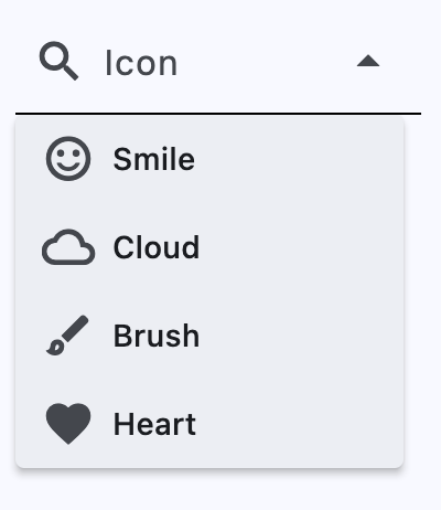
leading_icon(IconDataOrControl | None) –An optional Icon at the front of the text input field inside the decoration box.
-
menu_height(Number | None) –The height of the dropdown menu.
-
menu_style(MenuStyle | None) –The menu style that defines the visual attributes of the menu.
-
menu_width(Number | None) –The width of the dropdown menu.
-
options(list[DropdownOption]) –A list of options to display in the dropdown.
-
selected_suffix(Control | None) –A control to display after the selected item in the dropdown.
-
selected_trailing_icon(IconDataOrControl) –An optional icon at the end of the text field to indicate that the text field is
-
text(str | None) –The text entered in the text field.
-
text_align(TextAlign) –The text align for the TextField of the Dropdown.
-
text_size(Number | None) –Text size in virtual pixels.
-
text_style(TextStyle | None) –The
TextStyleto use for text -
trailing_icon(IconDataOrControl) –An icon to display at the end of the text field.
-
value(str | None) –keyvalue of the selected option.
Events
-
on_blur(ControlEventHandler[Dropdown] | None) –Called when the control has lost focus.
-
on_change(ControlEventHandler[Dropdown] | None) –Called when the text input of this dropdown has changed.
-
on_focus(ControlEventHandler[Dropdown] | None) –Called when the control has received focus.
-
on_select(ControlEventHandler[Dropdown] | None) –Called when the selected item of this dropdown has changed.
Methods
-
focus–
Examples#
Color selection with filtering#
import flet as ft


def main(page: ft.Page):
    page.theme_mode = ft.ThemeMode.LIGHT

    def get_options():
        colors = [
            ft.Colors.RED,
            ft.Colors.BLUE,
            ft.Colors.YELLOW,
            ft.Colors.PURPLE,
            ft.Colors.LIME,
        ]
        return [
            ft.DropdownOption(
                key=color.value,
                content=ft.Text(value=color.value, color=color),
            )
            for color in colors
        ]

    def handle_dropdown_select(e: ft.Event[ft.Dropdown]):
        e.control.color = e.control.value
        page.update()

    page.add(
        ft.Dropdown(
            editable=True,
            label="Color",
            options=get_options(),
            on_select=handle_dropdown_select,
        )
    )


ft.run(main)
Icon selection#
import flet as ft


def main(page: ft.Page):
    def get_options():
        icons = [
            {"name": "Smile", "icon": ft.Icons.SENTIMENT_SATISFIED_OUTLINED},
            {"name": "Cloud", "icon": ft.Icons.CLOUD_OUTLINED},
            {"name": "Brush", "icon": ft.Icons.BRUSH_OUTLINED},
            {"name": "Heart", "icon": ft.Icons.FAVORITE},
        ]
        return [
            ft.DropdownOption(key=icon["name"], leading_icon=icon["icon"])
            for icon in icons
        ]

    page.add(
        ft.Dropdown(
            border=ft.InputBorder.UNDERLINE,
            enable_filter=True,
            editable=True,
            leading_icon=ft.Icons.SEARCH,
            label="Icon",
            options=get_options(),
        )
    )


ft.run(main)
Styled dropdowns#
import flet as ft


def main(page: ft.Page):
    page.add(
        # 1
        ft.Dropdown(
            text_size=20,
            content_padding=10,
            color=ft.Colors.PURPLE_200,
            bgcolor=ft.Colors.BLUE_200,
            filled=True,
            border_radius=30,
            border_color=ft.Colors.GREEN_800,
            focused_border_color=ft.Colors.GREEN_ACCENT_400,
            focused_border_width=5,
            options=[
                ft.DropdownOption("a", "Item A"),
                ft.DropdownOption("b", "Item B"),
                ft.DropdownOption("c", "Item C"),
            ],
        ),
        # 2
        ft.Dropdown(
            border_radius=30,
            filled=True,
            fill_color=ft.Colors.RED_400,
            border_color=ft.Colors.TRANSPARENT,
            bgcolor=ft.Colors.RED_200,
            color=ft.Colors.CYAN_400,
            focused_border_color=ft.Colors.PINK_300,
            focused_border_width=20,
            options=[
                ft.DropdownOption("a", "Item A"),
                ft.DropdownOption("b", "Item B"),
                ft.DropdownOption("c", "Item C"),
            ],
        ),
        # 3
        ft.Dropdown(
            border_color=ft.Colors.PINK_ACCENT,
            focused_border_color=ft.Colors.GREEN_ACCENT_400,
            focused_border_width=25,
            border_radius=30,
            width=150,
            border_width=5,
            options=[
                ft.DropdownOption("a", "Item A"),
                ft.DropdownOption("b", "Item B"),
                ft.DropdownOption("c", "Item C"),
            ],
        ),
        # 4
        ft.Container(
            padding=ft.Padding.only(bottom=20),
            content=ft.Dropdown(
                text_size=30,
                color=ft.Colors.ORANGE_ACCENT,
                border_radius=20,
                filled=True,
                border_width=0,
                autofocus=True,
                focused_border_color=ft.Colors.GREEN_100,
                focused_border_width=10,
                width=200,
                height=50,
                options=[
                    ft.dropdown.Option("a", "Item A"),
                    ft.dropdown.Option("b", "Item B"),
                    ft.dropdown.Option("c", "Item C"),
                ],
            ),
        ),
        # 5
        ft.Dropdown(
            text_size=30,
            border_radius=20,
            filled=True,
            border_width=0,
            focused_border_color=ft.Colors.GREEN_100,
            focused_border_width=10,
            content_padding=20,
            width=200,
            options=[
                ft.DropdownOption(
                    key="a",
                    text="Item A",
                    style=ft.ButtonStyle(
                        shape=ft.BeveledRectangleBorder(radius=15),
                        color={
                            ft.ControlState.HOVERED: ft.Colors.WHITE,
                            ft.ControlState.FOCUSED: ft.Colors.BLUE,
                            ft.ControlState.DEFAULT: ft.Colors.BLACK,
                        },
                    ),
                ),
                ft.DropdownOption(
                    key="b",
                    text="Item B",
                    style=ft.ButtonStyle(
                        shape=ft.BeveledRectangleBorder(radius=15),
                        color={
                            ft.ControlState.HOVERED: ft.Colors.WHITE,
                            ft.ControlState.FOCUSED: ft.Colors.BLUE,
                            ft.ControlState.DEFAULT: ft.Colors.BLACK,
                        },
                    ),
                ),
                ft.DropdownOption(
                    key="c",
                    text="Item C",
                    style=ft.ButtonStyle(
                        shape=ft.BeveledRectangleBorder(radius=15),
                        color={
                            ft.ControlState.HOVERED: ft.Colors.WHITE,
                            ft.ControlState.FOCUSED: ft.Colors.BLUE,
                            ft.ControlState.DEFAULT: ft.Colors.BLACK,
                        },
                    ),
                ),
            ],
        ),
    )


ft.run(main)
Properties#
autofocus: bool = False
Whether the control will be selected as the initial focus. If there is more than one control on a page with autofocus set, then the first one added to the page will get focus.
bgcolor: ControlStateValue[ColorValue] | None = None
The background color of the dropdown menu
in various ControlState
states.
border_color: ColorValue | None = None
Border color. Could be transparent to
hide the border.
border_radius: BorderRadiusValue | None = None
The border radius applied to the corners of the dropdown input field.
Accepts a value in virtual pixels or a BorderRadiusValue object.
If set to None, the default border radius defined by the theme or system is used.
border_width: Number = 1
The width of the border in virtual pixels. Set to 0 to completely remove border.
capitalization: TextCapitalization | None = None
Configures how the text input should be capitalized.
content_padding: PaddingValue | None = None
The padding for the input decoration's container.
dense: bool = False
Whether the TextField is part of a dense form (i.e., uses less vertical space).
elevation: ControlStateValue[Number | None] | None = 8
The dropdown's menu elevation in various ControlState
states.
enable_filter: bool = False
Determine if the menu list can be filtered by the text input. Defaults to false.
If set to true, dropdown menu will show a filtered list. The filtered list will contain items that match the text provided by the input field, with a case-insensitive comparison.
enable_search: bool = True
Determine if the first item that matches the text input can be highlighted.
error_text: str | None = None
Text that appears below the input border.
If non-null, the border's color animates to red and the helper_text is not shown.
expanded_insets: PaddingValue | None = None
The insets for the expanded dropdown menu.
fill_color: ColorValue | None = None
Background color of the dropdown input text field.
Note
Will not be visible if filled=False.
focused_border_color: ColorValue | None = None
Border color in focused state.
helper_text: str | None = None
Text that provides context about the input's value, such as how the value will be used.
If non-null, the text is displayed below the input decorator, in the same location
as error_text. If a non-null error_text value is specified then the helper text
is not shown.
hint_text: str | None = None
Text that suggests what sort of input the field accepts.
Displayed on top of the input when it's empty and either (a) label is null or (b)
the input has the focus.
hover_color: ColorValue | None = None
The color of the dropdown input text field when hovered.
label: StrOrControl | None = None
Optional text that describes the input field.
When the input field is empty and unfocused, the label is displayed on top of the input field (i.e., at the same location on the screen where text may be entered in the input field). When the input field receives focus (or if the field is non-empty) the label moves above, either vertically adjacent to, or to the center of the input field.
leading_icon: IconDataOrControl | None = None
An optional Icon at the front of the text input field inside the decoration box.
If this is not null, the menu items will have extra paddings to be aligned with the text in the text field.
menu_height: Number | None = None
The height of the dropdown menu.
If this is None, the menu will display as many
items as possible on the screen.
menu_style: MenuStyle | None = None
The menu style that defines the visual attributes of the menu.
The default width of the menu is set to the width of the text field.
menu_width: Number | None = None
The width of the dropdown menu.
If this is None, the menu width will be the same as
input textfield width.
options: list[DropdownOption] = field(default_factory=list)
A list of options to display in the dropdown.
selected_suffix: Control | None = None
A control to display after the selected item in the dropdown.
selected_trailing_icon: IconDataOrControl = ARROW_DROP_UP
An optional icon at the end of the text field to indicate that the text field is pressed.
trailing_icon: IconDataOrControl = ARROW_DROP_DOWN
An icon to display at the end of the text field.
Events#
on_blur: ControlEventHandler[Dropdown] | None = None
Called when the control has lost focus.
on_change: ControlEventHandler[Dropdown] | None = None
Called when the text input of this dropdown has changed.
on_focus: ControlEventHandler[Dropdown] | None = None
Called when the control has received focus.
on_select: ControlEventHandler[Dropdown] | None = None
Called when the selected item of this dropdown has changed.

